She has been collecting interesting printed publications over the last three years in London, which takes up half of the space in her grand size luggage. Also, she likes to take photos of things that inspire her. Art Deco furniture, brutalist architecture, exhibitions, and so on. Probably that’s why she can’t live without the iCloud storage monthly plan. Not only so, if you look at the Instagram feed she follows, it’s stacked with well-produced design artwork, film photographs, and art sculptures.
I am glad to have a friend full of curiosity like her.

Rainy Alley
The installation is a typographic response to the poem Rainy Alley written by a Chinese poet Dai Wang Shu.
It experiments on loss of translation between Chinese and English, movement of the poem and imagination evoked by words.
The repeated shapes are visual complements to the rhymes from the original Chinese that is missing from the English translation. The movement conjures up the motion embedded in the poem.
Audiences are encouraged to walk through the rainy alley to read and interact with the words. Through the interaction, the words signify referents that sparkle the viewers’ imagination.


Two Points
“Ruins mark the passage of time or empire; they are remnants of the past or memento mori. They evoke decay, impermanence, and memory, humanity’s achievements as well as its hubris, and what is now gone.” —— Whitehouse, T. (2018)
The ‘ruins’ of the Ceramic Staircase are the visible cracks. These fissures are located, in order, of the decorative panels, the mosaic floor, the Henry Cole Memorial, the wall and lastly, the ceramic ornaments.
The colour of the paper with cut-out shapes represents the texture of where the ruins have taken place. The structure of the front and back cover is inspired by the arch which looms over the entrance of the space.
The folding is adapted from the accordion binding technique and is inspired by the sharp angles of the steps.


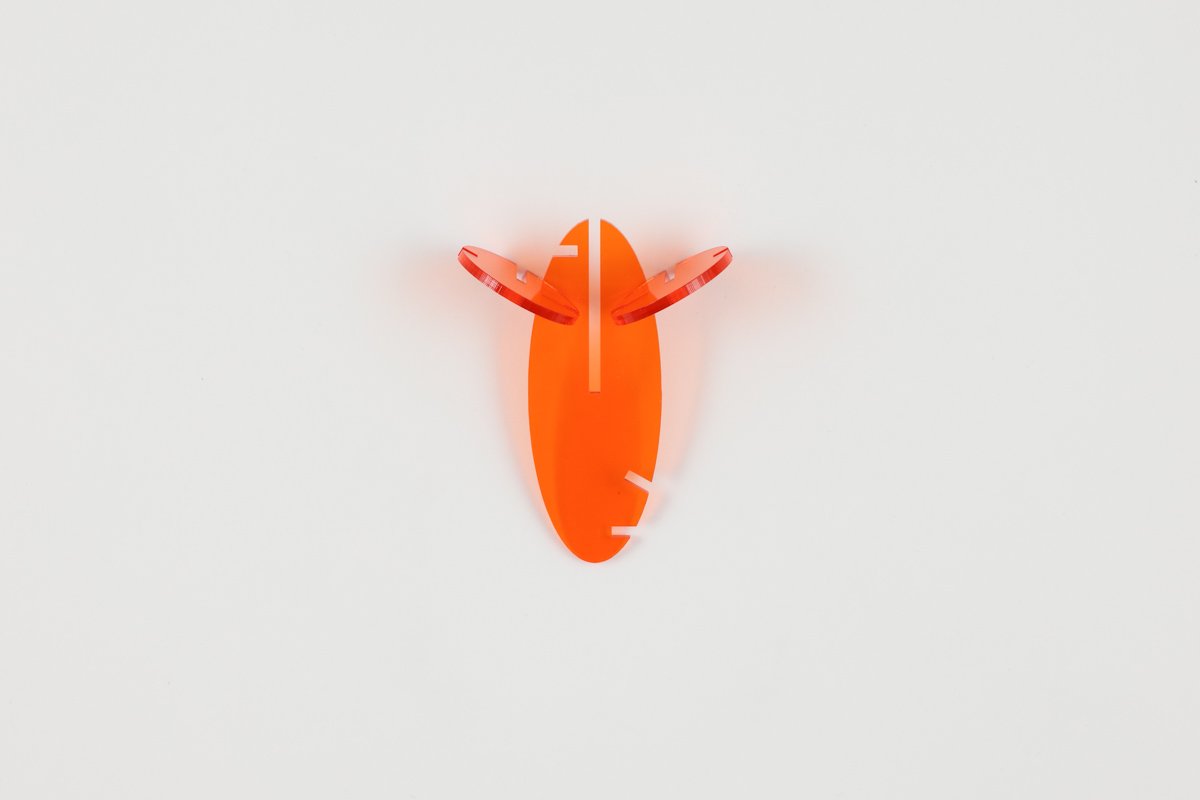
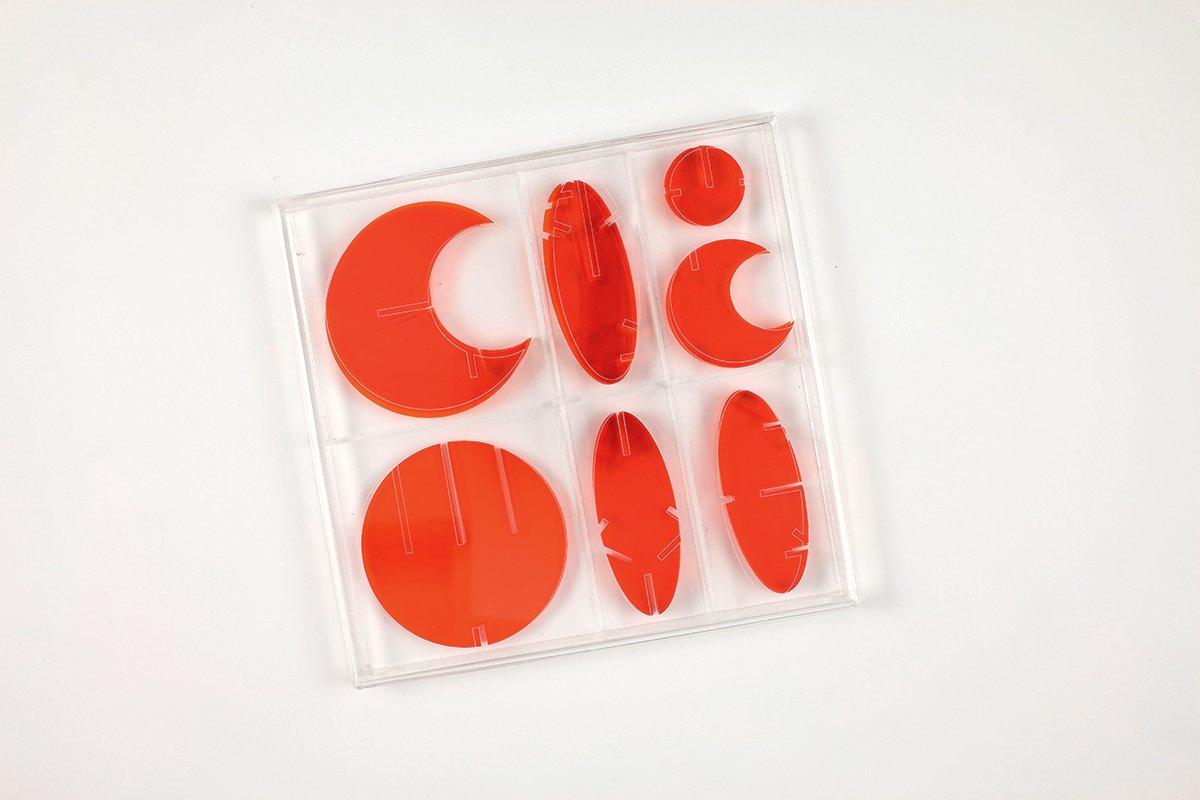
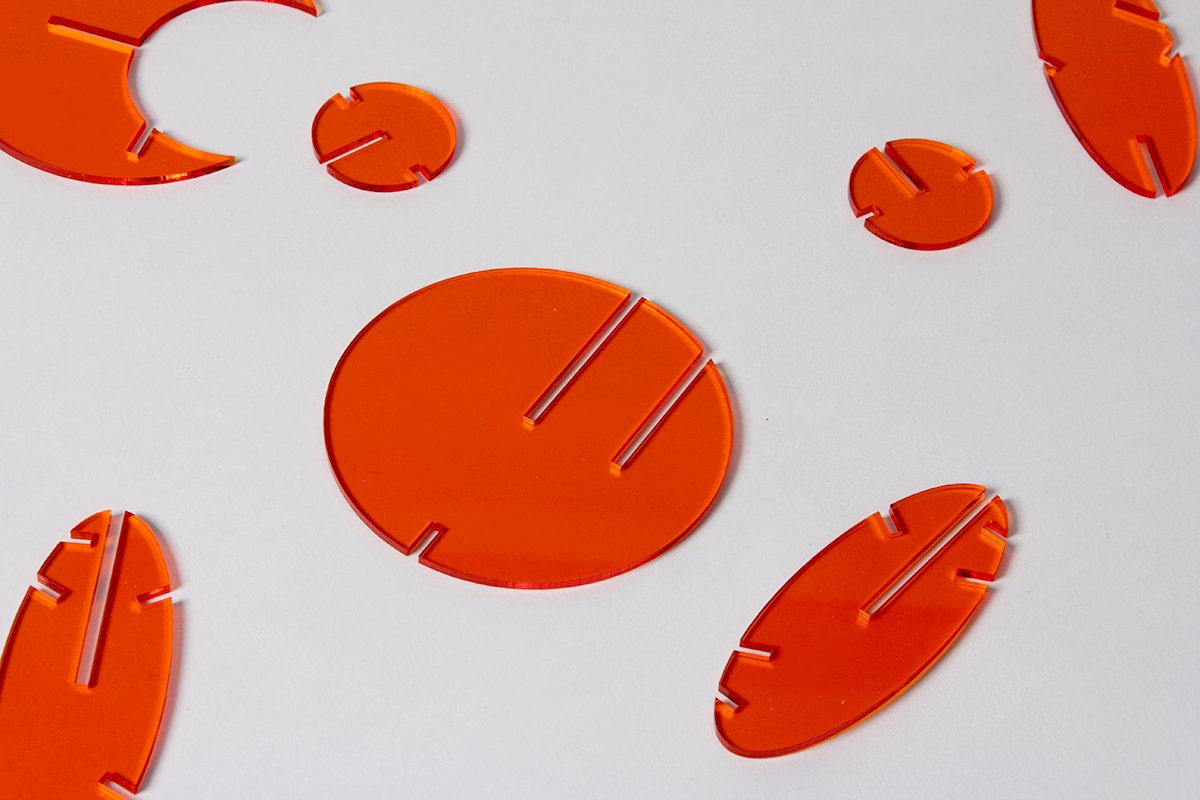
Octons Alphabet
Octons Alphabet is a typographic system that employs proportional two-dimensional shapes to construct three-dimensional alphabets. It allows audiences to construct not only letters, but also sculptures on their own.

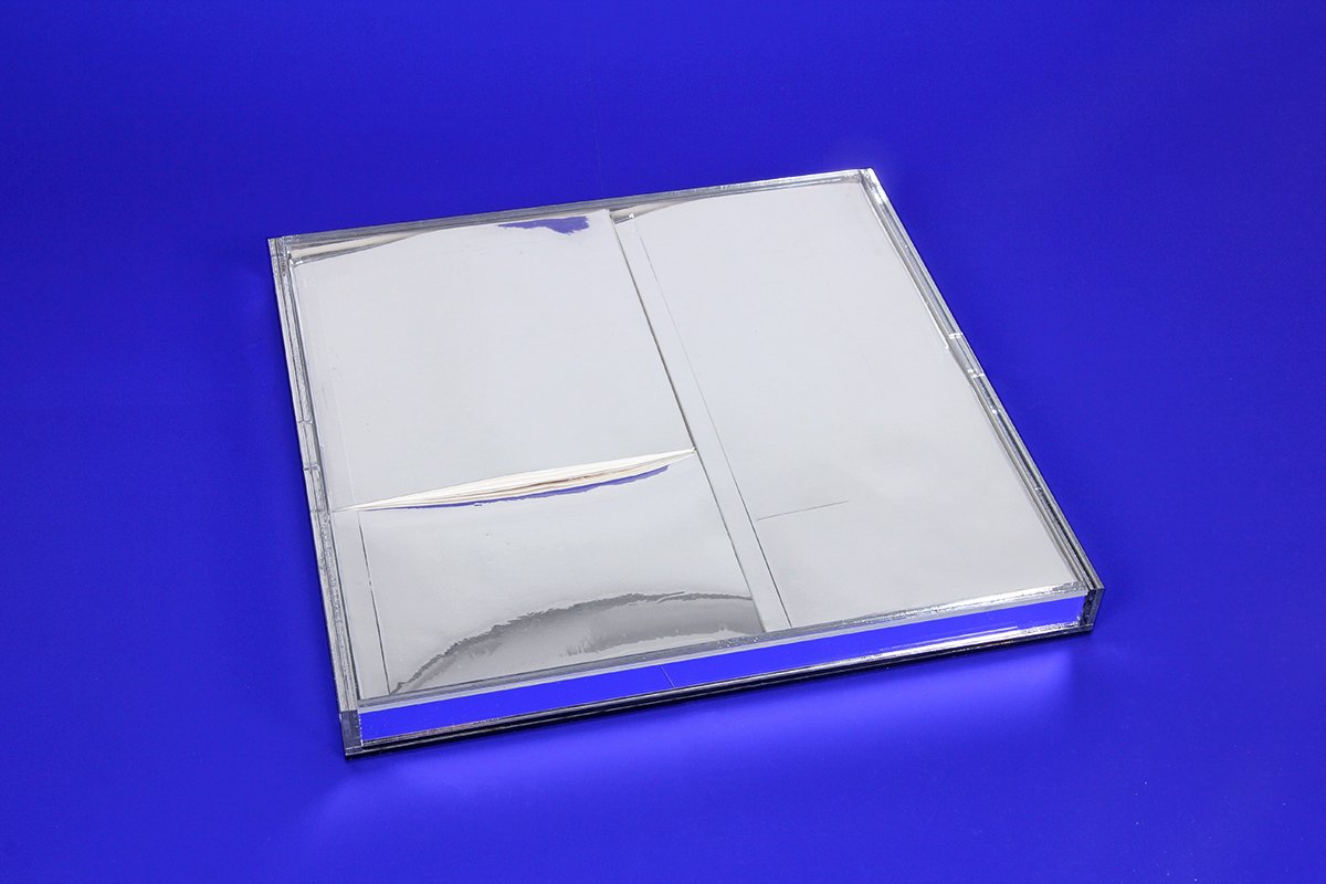
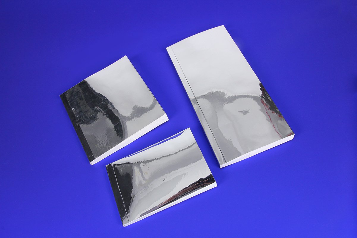
Mirror Bookset
The booklet is inspired by the “Untitled Painting” of Michael Baldwin, which questions the notion of painting transcending reality. Settled in a mirror appearance, it is designed to question what do books mean. What roles do books act for human other than they being mediums for learning? A “mirror” that helps people see through reality of life and themselves? An object sitting in one’s house as a decoration reflecting a reader's identity? Or, an artwork as the “Untitled Painting” that helps question the norms?
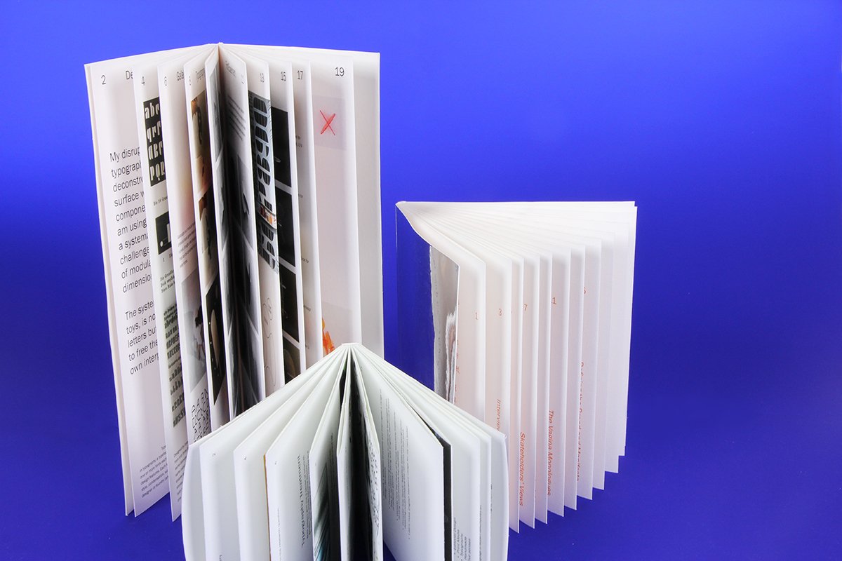
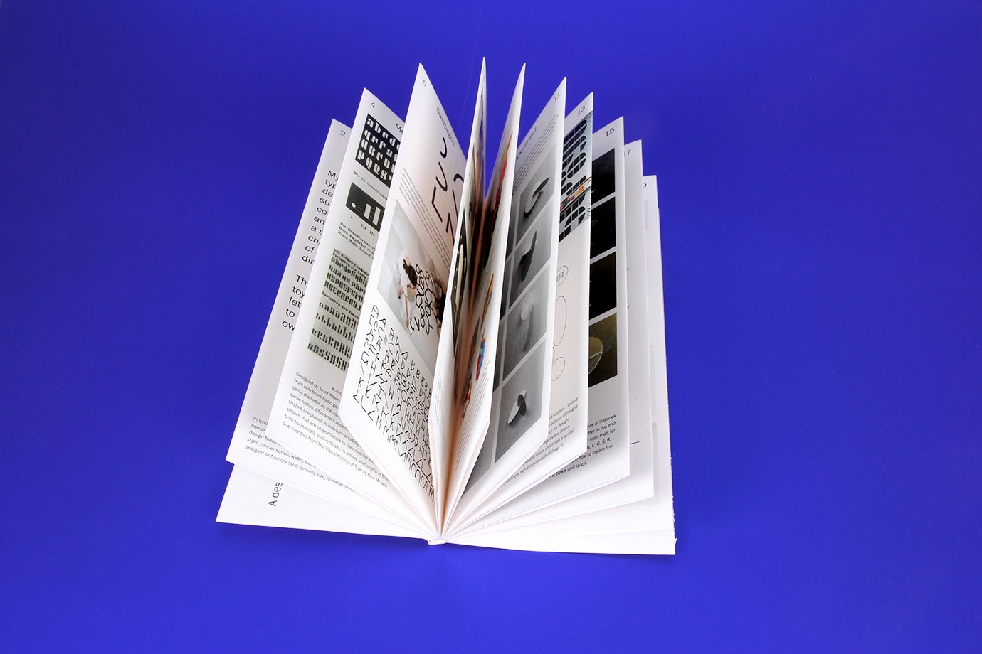
Design for Grime
A visual document on a design process for Grime - a music genre originates from London in the 1990s. The binding and paper in use accentuate the masculinity and vulgarity of the genre abstractly.


